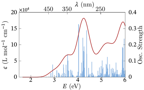
In our research, we often make plots of calculated spectra before and after broadening, such as the one shown below:
Please go straight to the Downloads page if you don’t want to read the description. Three ... two ... one ... zero ... Okay, here is the story: Over the years, after publishing quite a few research articles, I started to notice the sometimes silly appearance of graphics in research articles. I won’t show examples here, but since you are reading this web page there is a chance that you have noticed this, too: Graphics with huge textual labels, sometimes twice or more the font size in the article itself. This is distracting and quite frankly doesn’t look good. Typically, this happens when a graphics is not designed in the intended size. On the opposite extreme would be graphics with labels that are much too small to be legible when a large figure is scaled down to fit on a page or in an article column. Journals publishers typically state minimum font size requirements for graphical material for their articles (or book projects) but don’t seem to mind when the fonts in graphics are much too large.
Ideally, graphical material should be designed in the intended size, with
appropriately matched fonts. It doesn’t actually take much extra effort to design
figures that way. I wrote elsewhere on this web site about font setups for research
articles written in LaTeX and provide an article template using STIXTwo font sets.
To create the figure shown above in size 8x5 cm with 10pt fonts (smaller for
scripts/indices), I used the open-source software Gnuplot with its epslatex
terminal, along with the slightly modified LaTeX preamble from the aforementioned
article template and a customizable Gnuplot script. The collection of files used to
make the figure, including a shell script to create the resulting PDF graphics, can
be downloaded here. The PDF can be included in a research paper via
\includegraphics directives without further scaling. The advantage of the
epslatex Gnuplot terminal is that the resulting textual labels in the graphics are
generated with LaTeX using the fonts sets specified in the template preamble.
Although your publisher might not be using STIX[Two] font sets for their articles,
they tend to look great for scientific graphics that require Math, Greek characters,
and such.
© 2025 – 2025 J. Autschbach.